Clipart Ornaments With Inkscape

Very often we like to decorate something using clipart kind of ornaments. The net is full of images to download. But there is always the fuss with copyrights and royalties, things we should take seriously. And if we want to decorate our own designed handicraft, maybe it would be nice to design the decorations by ourselves, too. It's easier than you thought. You can browse clipart archives to get ideas, but very soon you will develop ideas of your own
In this instructable, I will show you one technique how to create an ornament or a detail of a bigger ornament, where we want a small detail to repeat while gradually change into something slightly different.
Supplies
Inkscape
Decide What to Draw

Image1 is showing my final design for a project of mine. I decided to draw a symmetric ornament that frames the bird and the title text. The bird is free clipart from the net and not a part of what I explane here.
So looking at the ornament, we see some symmetry and some regularity. This instructable is all about symmetry and regularity. The symmetry in my ornament is obvious. There are two plume like things symmetrically one another's mirror. This is kind of trivial, it should be basic image editing. Copy one object. Paste into same image. Flip horizontally. Position. Align.
The regularity thing needs more work. Looking at the top of one plume, we see 7 stems with drops at the end of them. The stems show some regularity. They are kind of identical, but change in form and shape in a regular way. So what I do is I draw the first stem, then I draw the 7th stem, then I let Inkscape interpolate to get the regularity. The interpolation simply creates the five stems inbetween. Well, simply in the meaning "you just let a function do the maths". The next steps show how it is done.
Draw One Stem of the Plume

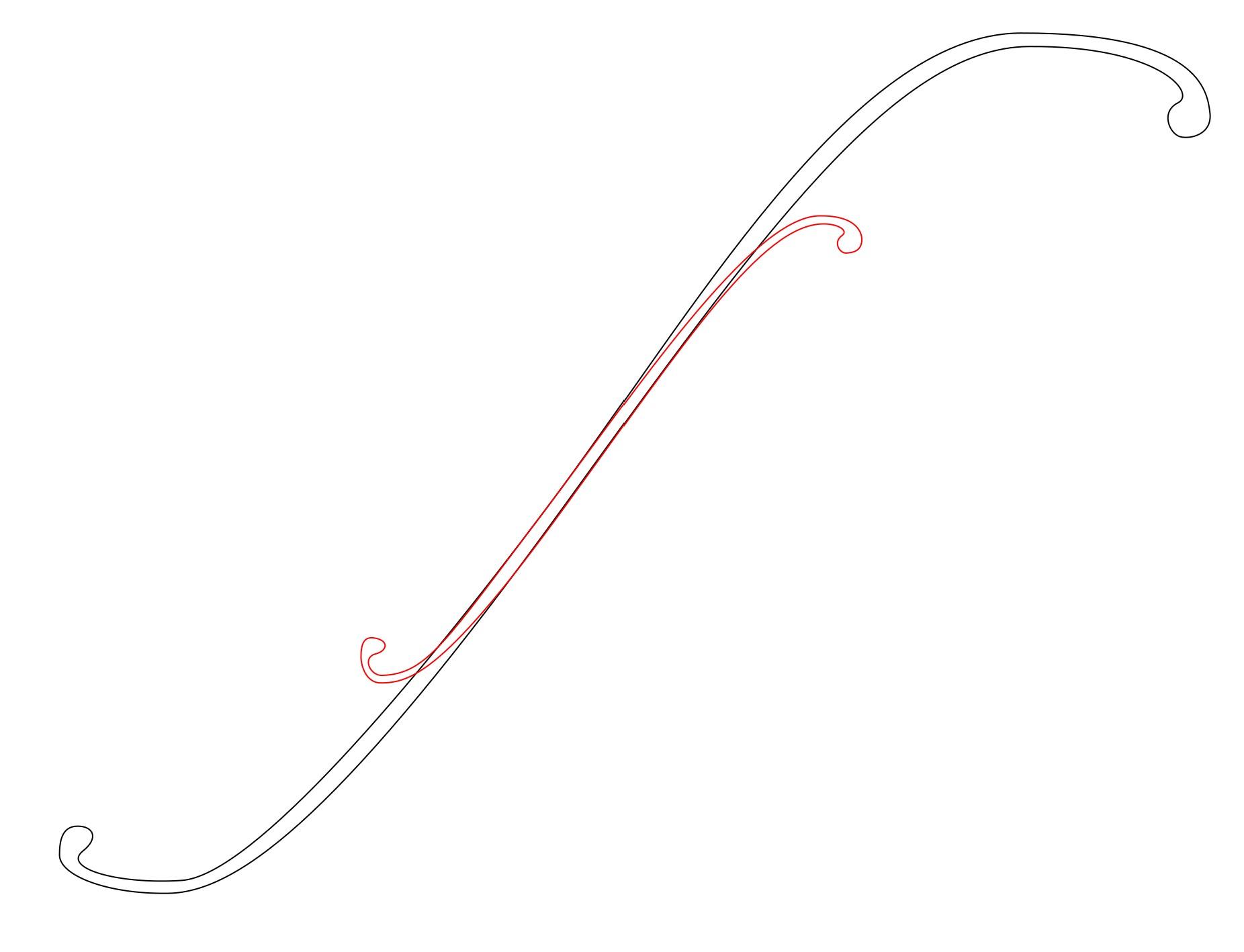
In short, I first draw a closed path like in Image 1. Then I duplicate it, scale down the duplicate, as well as edit the duplicate in other suitable ways. Image 2 shows the original in black and the duplicate in red. These are the first and seventh stems of the ornament. Now we need five more inbetween. Interpolated.
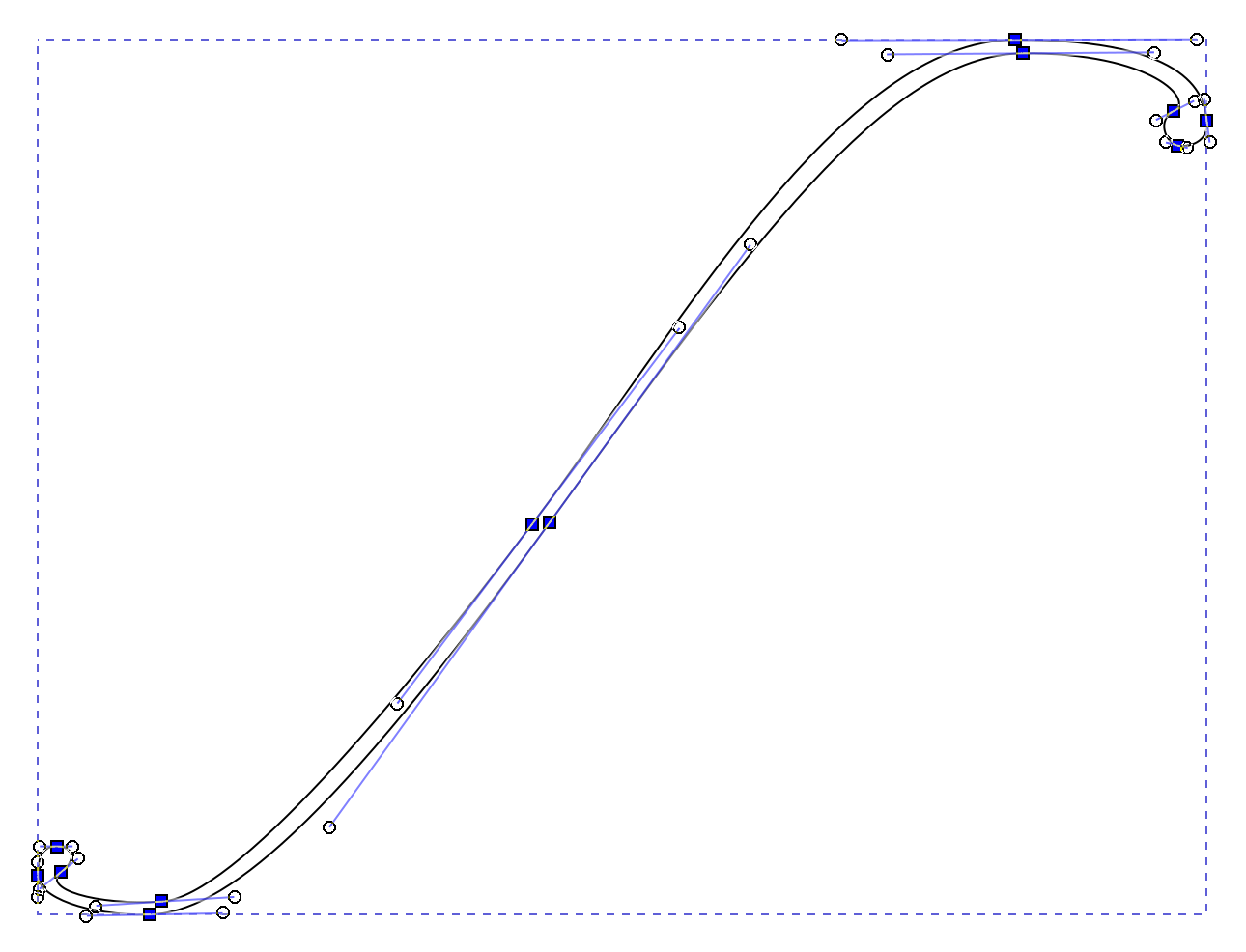
But before that, a few important notes. The stem elements in this ornament are smooth beziere splines. The smoother, the better end result. The fewer nodes in the path, the better end result. Image 3 shows that there are 12 nodes in the path. If you know how to draw simple smooth paths like this, jump to step 4. Perhaps you also noted that one could achieve more symmetry by just drawing the upper half of the stem, duplicate it, rotate and join the both halves. But I never needed that. If I had done that, I still would have edited either half to make them slightly different.
Anyway, step 3 will show a quick and dirty way to draw the simple stem, similar to image 1.
Drawing Smooth and Beautiful Elements by Freehand
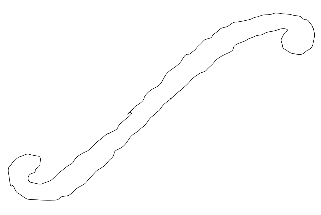
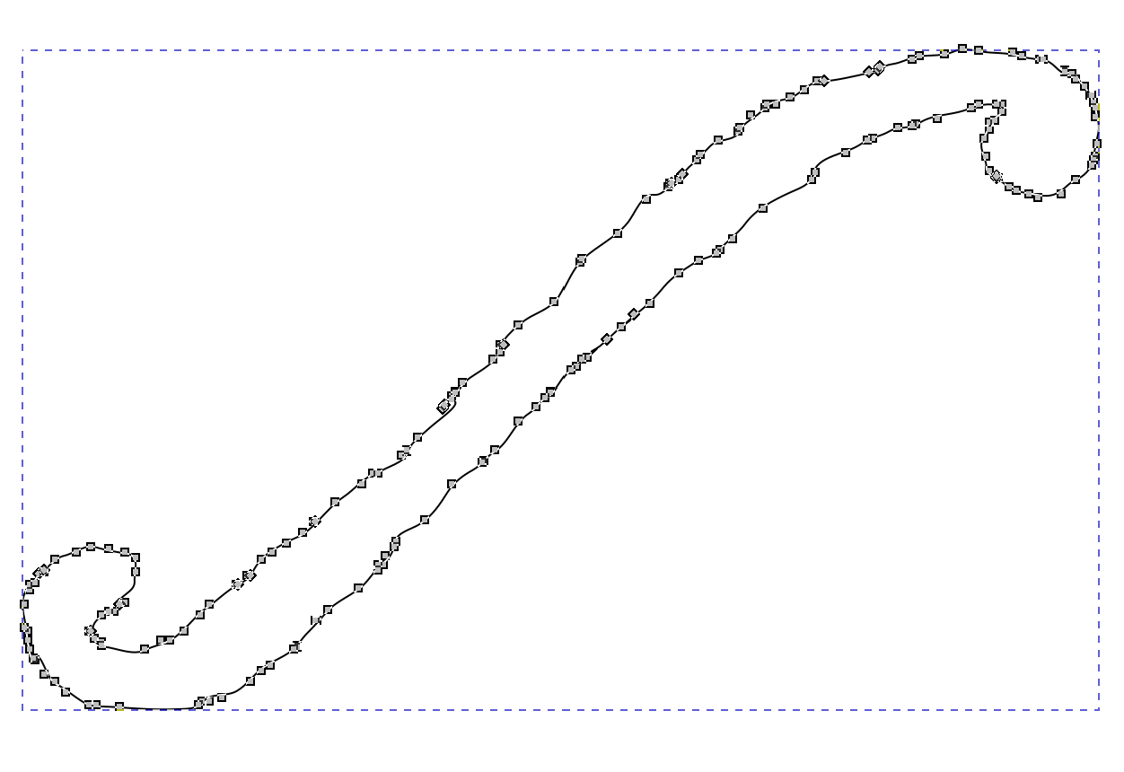
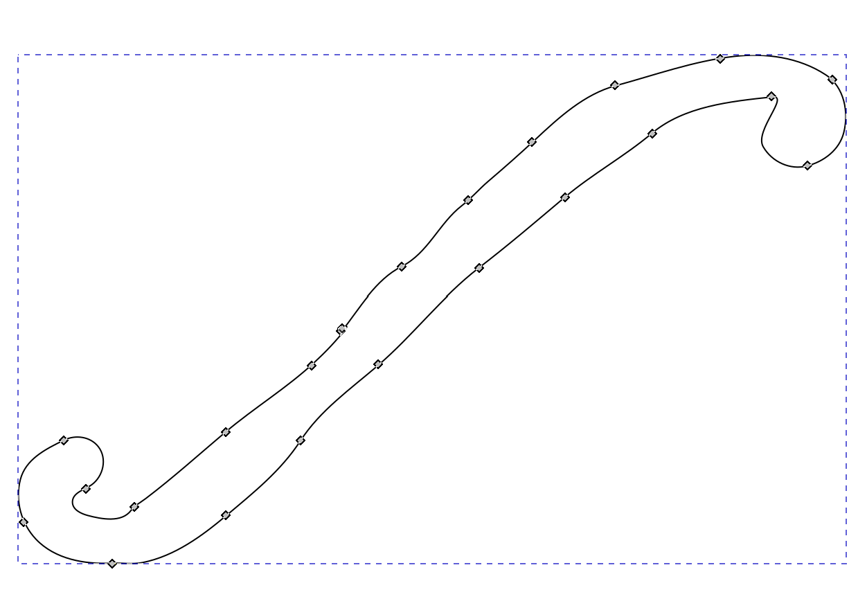
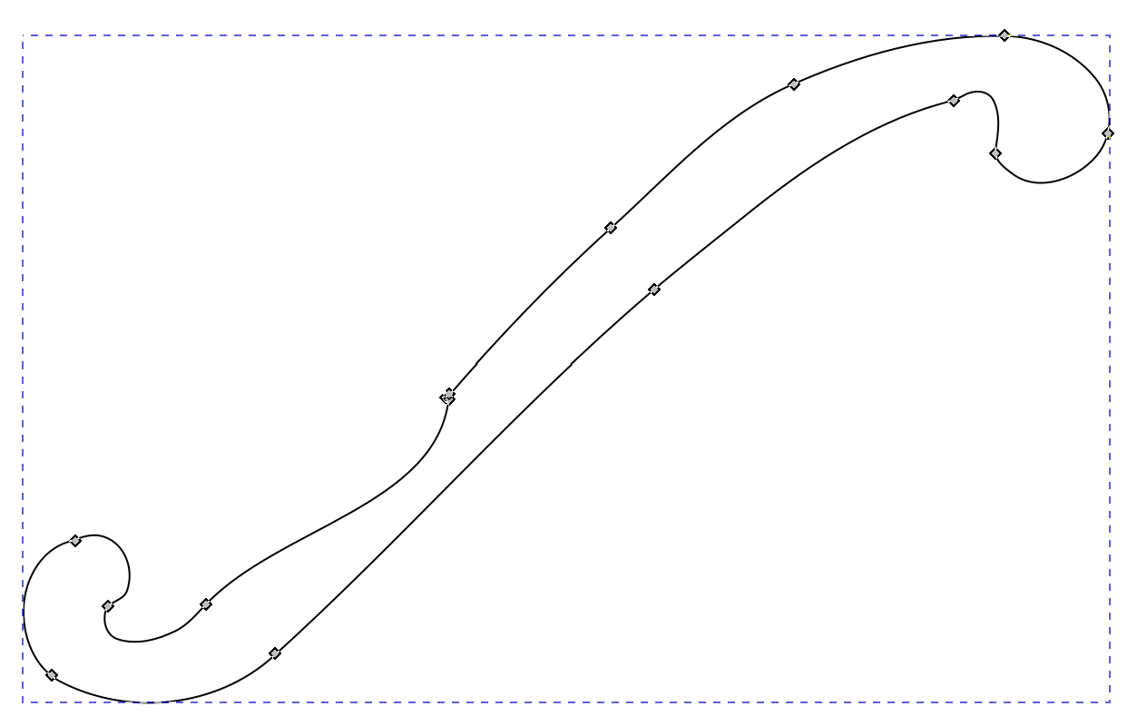
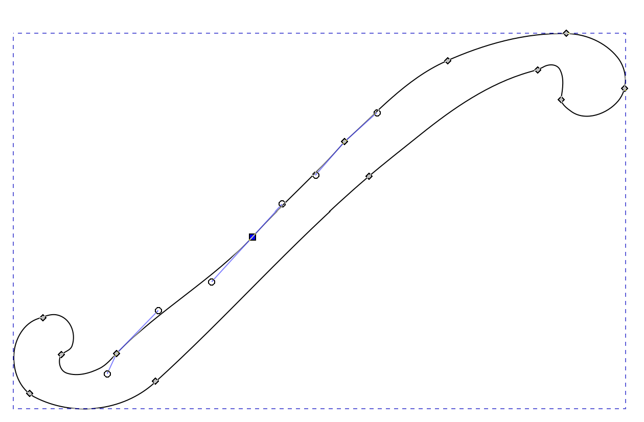
Inkscape has lots of tools for lots of different drawing techniques. The ornament in this instructable logo I drew with the beziere tool, but beginners assumably prefer to just try the pencil, or freehand tool. With that (and a lousy drawing aid called a mousepad), we manage to draw something like image 1. As image 2 shows, the drawn path have zillions of nodes. Well, zilty, maybe, not zillions. But now we can smoothen the curve with ctrl+L. The more we smoothen, the less nodes are left. At some point we start to lose too much of them. And the start and end nodes don't seem to meet.
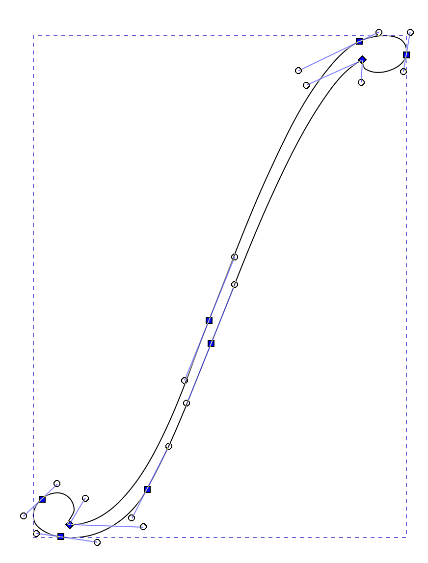
We have to make them meet and join to a single node, like in image 5. And all or most nodes need to bee smooth nodes, not cusp nodes. Editing nodes, using control points, deleting single nodes or adding them, all this is next step from entry level skills in Inkscape. If you know nothing about that, pause now, check this tutorial, lesson 8, or any similar, come back here and continue, ok?
Image 6 shows a further edited path. I rotated it a bit, I moved all nodes at the top to make the whole thing longer, i moved the middle nodes more to the center. Finally I moved the control points nearer to their nodes along the straight part of the stem. This will make it easier to work with the duplicate to the next.
So we make a duplicate, which will be the 7th stem. Shorter and tinyer in every sense. Using the node tool, we can move the three nodes of the top how we want. Note the two middle nodes. They will be our anchor points with which we can align this duplicate with the original at some point. Further editing will result in image ***, again with the duplicate marked in red. The middle nodes are matching perfectly with the black original stem.
Doing the Interpolation


Ok, now I have drawn one object, a "double ended stem" as a part of my "double ended plume". And I've made a duplicate of it and edited the duplicate, so both represent the start and the end stems of the plume. This is image 1.
I select both paths. Then I go to Extensions->Generate from path->Interpolate. In the dialog that opens, I set interpolation steps to 5 and tick Live preview (image 2). At this point you may or may not get a great looking result. I obviously did not. What happened in image 2 was probably that Inkscape added some nodes here and there, implied by the option "Split paths into segments...". Just by choosing "Discard extra nodes..." I got it almost right, image 3. But note how the bottom stems overlap, while the tinier top stems have big gaps inbetween. This is because the stems are distributed linearly evenly, although they get thinner. Changing the exponent option to anything other than 1.0 will change that.
Think of the curve y = x from 0 to 1. A straight line ascending at 45 degrees. Think further that the function of the curve is y = x¹. Now change that exponent slightly and the line starts to bend. y = x² bends to a parabola.
Going over 1.0 moves the interpolated stems towards one end. Going under moves them to the other end. Smoothly. Just test which one you need. The direction is determined by in which order you selected the two paths before starting the interpolation.
The other problem in image 3 is that the lower interpolated stems seem to get thicker before they eventually end up in the thinner end. This must be due to my editing of the nodes. I'm just saying that the original path and the duplicated and edited path should resemble each other as much as possible, while at the same time have the transition we want. I must have moved one node too much.
Have a look at the two paths in image 4. The paths look very same, but the middle node is on a very different place. As I wrote, I must have moved one node very much between two other nodes while editing the duplicate, just to get the right shape of the duplicate. This might be the reason why the interpolated stems got thicker. What I should have done was move the corresponding node the same way in the original path, carefully adjusting everything not to lose too much of the over all shape. Just like the middle node in image 4 has moved without affecting the whole shape too much. The next level of designing curves would be learning to place the nodes right in the first place.
Having the "Duplicate endpaths" checked is convenient. After clicking Apply and Close - when you are satisfied with what you see in the preview - you have a new graphic object with all 7 stems, not only the 5 intermediate stems. Move it aside and you find your two original paths untouched underneath. And can create another ornament with slight variations, either in the paths or in the interpolation settings. Just go for it!
Further Refinements

The 7 stem object is kind of monstrous. To be used as such, we want to combine all into one path. Unless the mishmash of curves is what we want, I admit it looks cool for some purposes. But filling all with black makes them look like one thing. If that's the end purpose - like it is in my project image - they should also be combined into one path.
After the interpolation, we have these 7 objects grouped, which means they are moved, resized, coloured etc. together, while still being individual objects. First we ungroup them with shift-ctrl-g, then we union them (is that a verb?) with ctrl-plus, or Path->Union. After that, it's just one single object.
Image 1 shows the final object, still with only a black outline. Note how this reveals two stem drops overlapping each other at the bottom left. If this is undesired, too bad! Just make some steps backwards and do it again. Then we have a black version without line colour. If you use fill colour and don't use a different outline colour, try not using line colour at all. It's a bit like comparing regular or bold font. Either is better for your purpose. If you don't feel a difference, even though you notice it, leave the line out.
The next black version has a path effect, which puts a nice bend on everything. It makes the line of stem drops curve instead of being in a dull straight line. Look into Inkscape path effects, I won't touch that subject here further.
What's that ugly larva in the same image? Well, that was my hand drawn thing that I started with. I end this instructable here. Feel free to comment and ask questions!