Creating a Graph in Google Sheets
by danielr24 in Living > Education
197 Views, 1 Favorites, 0 Comments
Creating a Graph in Google Sheets


The Google Sheets Graph feature allows you to turn raw data into a variety of graphs. Whether you’re tracking sales patterns or creating graphs for biology class, Google Sheets offers bar charts, line graphs, pie charts, and anything else that fits your needs.
Supplies
- A laptop or device with internet access
- A Google Account
- A Google Sheets document with a complete dataset
Create a Complete Raw Data Set

The data displayed in the graph cannot be directly edited. Ensure that your data is complete before generating any graphs.
Open Graph Menu

Step 1. Select “Insert” on the toolbar
Step 2. Select “Chart” in the pop-up menu
This will create a graph you can use if you are satisfied with its features. If you wish to create a different graph or to change any features, keep reading.
Select Graph Type

Step 1. In the “Setup” tab, click the “Chart type” drop-down menu
Step 2. Select the type of graph you want from the selections
Edit Title/Axis
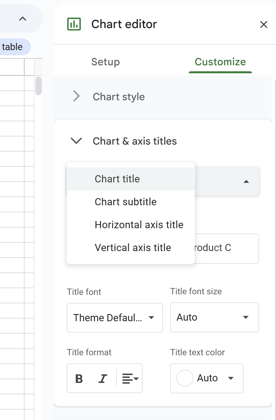
Step 1. In the “Customize” tab, click “Chart and Axis Title.”
Step 2. In the “Chart and axis Title” tab, click “Chart Title” and select which axis/title you wish to edit
Step 3. Change the title/color/font/size of whatever you choose
Although Google Sheets has many more settings you can adjust on the graph, the title and axis are the most used features, so I’ll just focus on those. If you wish to change other features, they follow a similar format.