Let's Map! How Safe Are the Streets of Santiago?
by mjrovai in Teachers > Social Studies
3684 Views, 22 Favorites, 0 Comments
Let's Map! How Safe Are the Streets of Santiago?
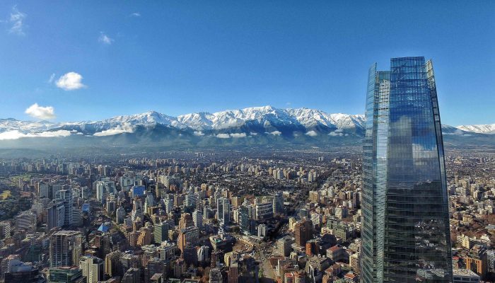
Let’s answer it with Python and GeoPandas!
Some time ago I wrote an article, explaining how to work with geographic maps in Python, using the “hard way” (mainly Shapely and Pandas): Mapping Geography Data in Python. Now it is time to do it again, but this time, explaining how to do it easily, using GeoPandas, that can be understood as Pandas + Shapely at the same package.
Geopandas is an open-source project to make working with geospatial data in Python easier. GeoPandas extends the datatypes used by Pandas to allow spatial operations on geometric types.
The motivation for this article was a recent project proposed by our professor Oscar Peredo and developed with my colleagues, Fran Gortari and Manuel Sacasa for the Big Data Analytics course of UDD’s (Universidad del Desarrollo) Data Science Master Degree.
The objective of that project was to explore the possibility of, taking advantage of state of the art Machine Learning Algorithms, to predict crash risk score for an urban grid, based on public car crash data from 2013 to 2018. By the other hand, the purpose of this article is simply to learn how to use GeoPandas, on a real problem, answering a question:
“How safe are the streets in Santiago?”.
If you want to know what we have done with the proposed project for our DS Master degree, please visit its GitHub repository.
Installing and Starting GeoPandas

The first thing that you should do when working with GeoPandas is to create a new and fresh Python Environment and from that, install the package. You can simply install it using PIP, if all dependencies are installed as well:
pip install geopandasBut as recommended on GeoPandas official page, the best way to do it from a fresh environment is using conda (GeoPandas and all its dependencies are available on the conda-forgechannel):
conda install --channel conda-forge geopandas
Starting with GeoPandas
A great start to learning GeoPandas is to follow the article from Benjamin Colley: Let’s make a map! Using Geopandas, Pandas and Matplotlib to make a Choropleth map and also take a look at the work of Eduardo Graell-Garrido, in Spanish, Workshop de Cartografía en Python.
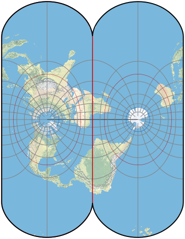
When working with geographic maps, it is crucial to define what kind of Earth projection will be used. In this article, the actual coordinates used are in lat-long ( EPSG: 4326) mode, with its units in decimal degrees, and on the surface of a sphere or ellipsoid of reference: as shown above, WGS 84 (also known as WGS 1984, EPSG:4326).
Another possibility would be to work with Transverse Mercator Projection, which would be a 2D map in meters (For Chile ‘ESPG: 5361’) as also shown above.
This is your choice but take into consideration that you can not mix them.
Let’s Map!

maps.png)
import numpy as np
import pandas as pd
import matplotlib.pyplot as plt
import seaborn as sns
import geopandas as gpd
from shapely.geometry import Point, Polygon
The first shape that we will download will be the polygon that will define the area where we will work. In our case, Santiago urban area! The Vectorial map can be found at Chilean National Congress Library (BCN) . The available map, contains in shapefile format, all 400 urban areas of Chile. We should filter it to “Santiago” and converted it to ESPG:4326:
sf_path = "../data/BCN/areas_urbanas/areas_urbanas.shp"
sf = gpd.read_file(sf_path, encoding='utf-8')
stgo_sf = sf[sf.NOMBRE == 'Santiago']
stgo_shape = stgo_sf.to_crs({'init': 'epsg:4326'})
stgo_shape
At this point, we have a geopandas dataframe, that has only one line, which includes besides some data as length and area, the ‘geometry’, that is the coordinates of the polygon which “envelop” all city.
We can plot this geodataframe, the same way we are used to doing with a normal pandas dataframe:stgo_shape.plot()The result you can see above. Note that Longitude (horizontal axis), goes from around -70.80 (West) to -70.45 (East) and Latitude (Vertical axis), goes from -33.65 (South) to -33.30 (North). You can confirm the exact city bounders using:
stgo_shape.total_boundsAlso, it is possible to get the center coordinates of the shape (or centroid):
stgo_shape.centroid
Above you can see the same area on Google maps, with the Pacific Ocean to the left (West) and the Andes and the Argentinian border to the right (East).
Importing Roads From OpenStreetMap

OpenStreetMap(OSM) is a collaborative project to create a free editable map of the world, built by a community of mappers that contribute and maintain data about roads, trails, cafés, railway stations, and much more. Rather than the map itself, the data generated by the project is considered its primary output.
The site GeoFabrik has data extracts from the OpenStreetMap project which are normally updated every day. This open data download service is offered free of charge by Geofabrik GmbH.
Start downloading the data from this link, and saving it on your /data/ depository under "/OSM/". From there, let's open the shapefiles regarding roads:roads_path = "../data/OSM_Chile/chile-latest-free/gis_osm_roads_free_1.shp" roads = gpd.read_file(roads_path, encoding='utf-8')This file contains almost 455,000 roads. Let's start filtering it with our Santiago shape (for that we will use .sjoin), so we can handle only the roads that are inside our area of interest.
roads = gpd.sjoin(roads, stgo_shape, op='intersects')
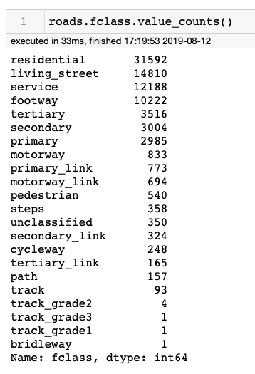
Even filtering, we finished with around 83,000 roads. Examining the roads geodataframe, we can see that it includes a column named fclass. Let's give a look at it at above table.
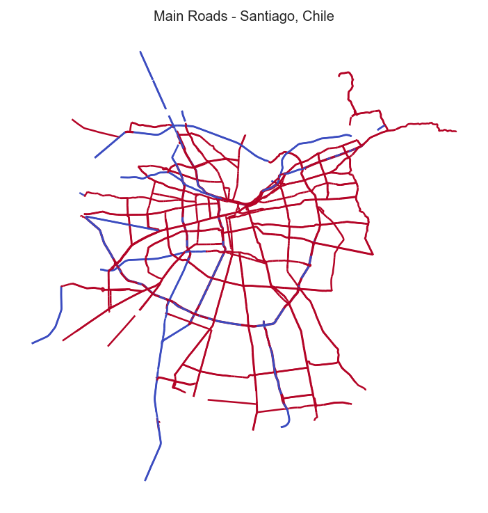
That means that several roads are mainly in residential areas and also the ones that are used as service, footway, cycleway, pedestrian, etc. Once we will be interested in mapping car crashes, let's keep only the roads were most probably we will find them, which will reduce the dataset to about 12,000 roads. We can also filter only the main roads (primary and motorway):main_roads = car_roads[(car_roads.fclass == 'primary') |
(car_roads.fclass == 'motorway')
]
main_roads.plot()
(see above plot)
Importing Car Crashes From a Public dataset

p0 = Point(0,0)
df_p0 = df_2018['geometry'] == p0
df_p0.sum()
The result is 3, 537 points. Let's take them out and see how much clean data we have:
s_2018 = df_2018[df_2018['geometry'] != p0]
s_2018.shape
The result: 20,402 events. Very good! We can work with those data. Let's filter them, to get only the events inside the Santiago area and plot them:
ax = stgo_shape.plot(figsize=(18,16), color='#EFEFEF', edgecolor='#444444')
main_roads.plot(ax=ax, color='green', markersize=0.2)
crashes.plot(ax=ax, color='red', markersize=8)
plt.title("2018 Road Crashs - Santiago, Chile");
plt.axis('off');
Wow! Visually seems that almost every road in Santiago had a car crash in 2018!Digging Into data
To really understand what happened, we need to go deeper into data. Looking into the dataset, we can see that besides 'geometry', that contains the geolocalization of every crash event, also we will find relevant information as:
- When the crash happened (Day and hour)
- Location and zone (Rural and Urban)
- Type of location (crossing road, roundabout, straight road, curve, etc.)
- Number of lanes and type of construction (asphalt, concrete, etc.)
- Road condition (dry, humid, oil, etc.) Weather condition (rain, snow, clean, etc.)
- Type of event (Collision, Bump, human hit, fire, etc.)
- Severity (Fatal, Serious, Moderate, Minor, Non-Injury)
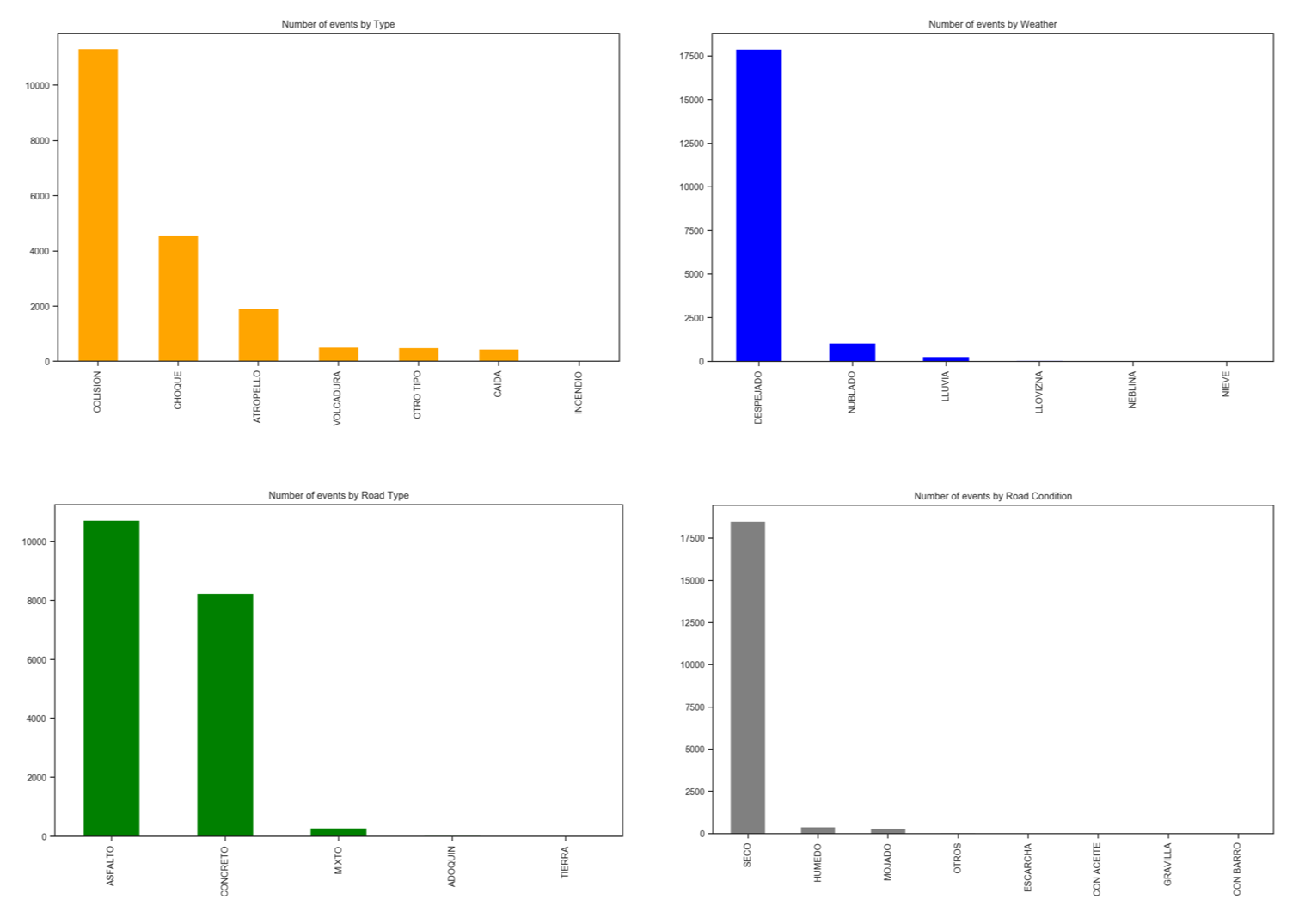
Let's visualize some of those events and their main characteristics: From the above visualizations, we can see that the majority of car crashes in Santiago during 2018, were collisions and bumps in asphalt or concrete roads, been that almost all of them happened on a clear and dry day. And how about when they happened? Let's create new columns with data related to time:
crashes['Fecha'] = pd.to_datetime(crashes['Fecha'])
crashes['Hora'] = pd.to_datetime(crashes['Hora'])
crashes['month'] = crashes['Fecha'].dt.month
crashes['day'] = crashes['Fecha'].dt.day
crashes['weekday'] = crashes['Fecha'].dt.weekday_name
crashes['hour'] = crashes['Hora'].dt.hour
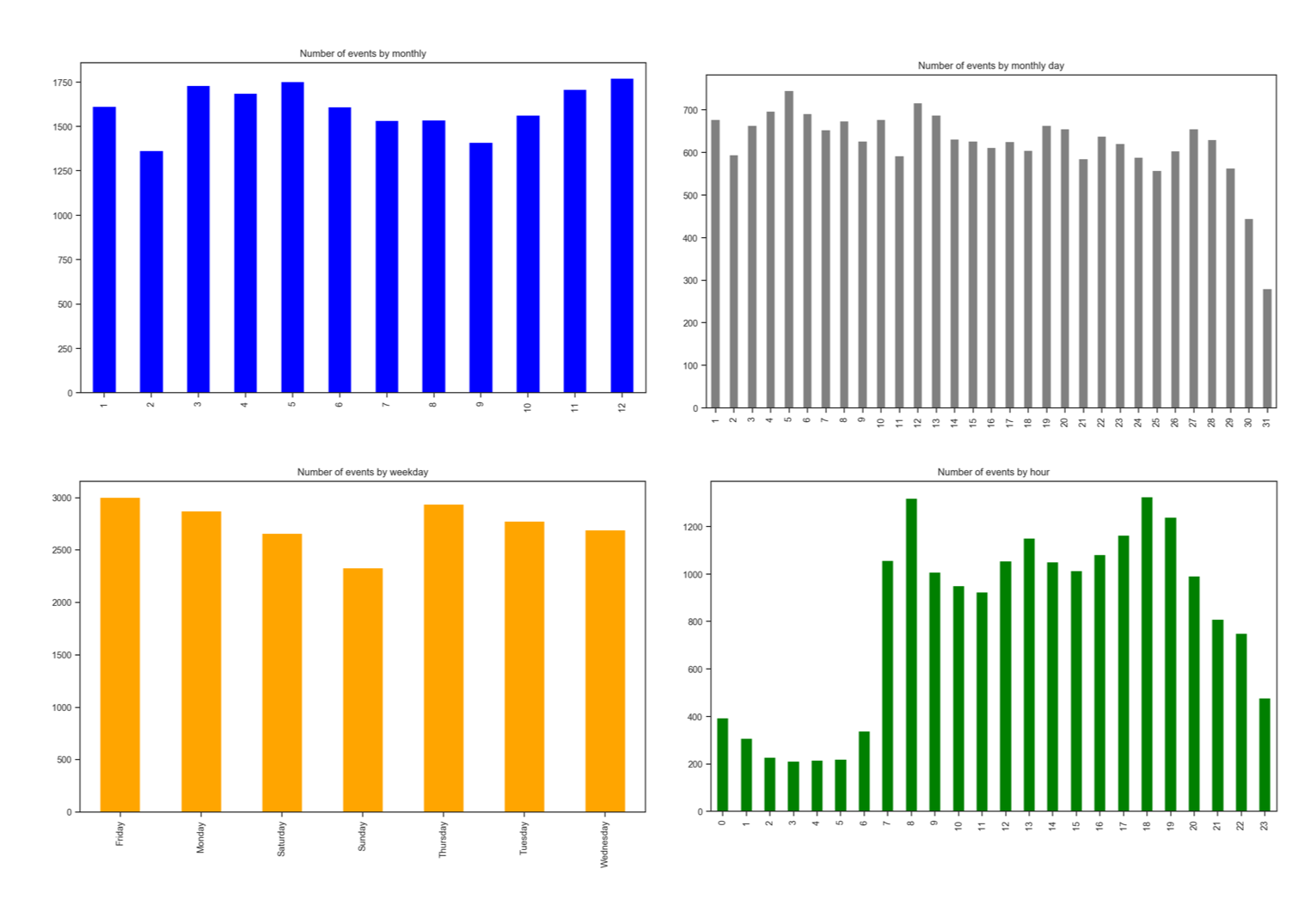
Well, no surprises. Majority of events happened from 7am to 10pm, having the transit pick-hours (8am and 6pm) the most complicated ones. Also, crashes occur less on weekends and at the end of the months (an interesting point that should be better investigated). Note that February is the month with fewer events. This is because it is the summer vacation season for Chileans and Santiago became usually "desert" at this month.
Creating A Heat-Map


A great way to visualize data on GeoPandas is to aggregate data on small areas having a color schema showing us the volume of data present in that specific area. For example, fewer events will result in a light color (as yellow) and more events on a darker color as brown.
First, we need to split the city into small zones (or polygons). You can use grids, sensus zones, etc. In our case, we will use the zones defined in the last Chilean Origin-Destiny Survey (EOD), available from SECTRA (Transport Planning Secretary - Chile).
Once you have downloaded the shapefile, you should intersect it with your area of interest (in our case, stgo_shape). The result will be 743 smaller zones to capture our car crash data.
See above Map in blue.
Next, you should aggregate the events into city zones. For that, two main tasks should be done:
- A join between the above fileshape and the crashes dataset. The resultant dataset will have for each line a point (crash) and a polygon associated (around 20,000). You will note that every polygon will be repeated for each point (event) that was captured on its area.
- A group of resulting dataset, by zones id. The resultant shape should have the same number of lines as the original one (743).
Visualizing the heatmap is very simple. For that, you should use a simple plot function, but defining 2 parameters:
- cmap: the colomap name that will be used. In our case 'magma_r'.
- k: Number of classes that you want to 'split' your data range. In our case, 5 (usually, it is recommended not to use more than 7 colors to represent your range of data).
ax = crash_zone_2018.plot(column='crashes', cmap='magma_r', k=5, legend=True)
plt.title("2018 Crashes by Zone - Santiago");
ax.set_axis_off()
Now it is visually easy to distinguish the most dangerous areas (the darker ones). But how those areas are related to roads? Let's visualize Santiago main Roads over the last map: fig, ax = plt.subplots(figsize = (10,6))
crash_zone_2018.plot(ax=ax, column='crashes', cmap='magma_r', k=5, legend=True)
main_roads.plot(ax=ax, color = 'blue')
plt.title("2018 Crashes by Urban Zone and main roads - Santiago City");
ax.set_axis_off();
Looking at the last visualization, we can see that for example, areas near the main road's intersections, are more propense to have accidents.
Another very useful way to see a large quantity of data on a map is using "topographic view". It is like to see a mountain, higher the mountain, darker is the color (of course, there will be not hight, but the number of accidents). Eduardo Graells-Garrido did a great job on his work, exploring mobility at Santiago city. Based on his code, we can create ours as shown above. At first glance, we can realize where are the most dangerous areas of the city.
On the GitHub you can see the code used to create that visualization.
Creating a Severity Index
def sev_index_crash(row):
    if row['Fallecidos'] != 0: return 5   # fatal
    elif row['Graves'] !=0: return 4      # serious
    elif row['Menos_Grav'] !=0: return 3. # less-serious
    elif row['Leves'] !=0: return 2.      # minor
    else: return 1                        # non-injury
crashes['SEV_Index'] = crashes.apply(sev_index_crash, axis=1)
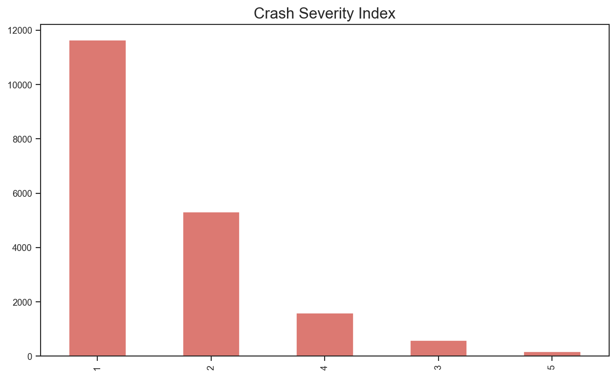
Having the column, let's visualize the new data: SEV_Index = crashes.SEV_Index.value_counts() SEV_Index.plot.bar(title="Crash Severity Index", color = 'red');Fortunately, the great majority of 2018 crashes resulted in non-injures (1), following with over 5,000 minor injuries (2).
Associating Severity Index To roads
On the project for the discipline of BigData Analytics of our Data Science Master at UDD, the city was converted on a 100mx100m grid, having each one those “cells” associated with city roads. This approach resulted in 63,000 small areas where the main objective was to determine the probability of that specific area had a future accident.
For this tutorial, a simpler solution will be used, that was proposed by Alex Raichev on KIWI PYCON 2017.
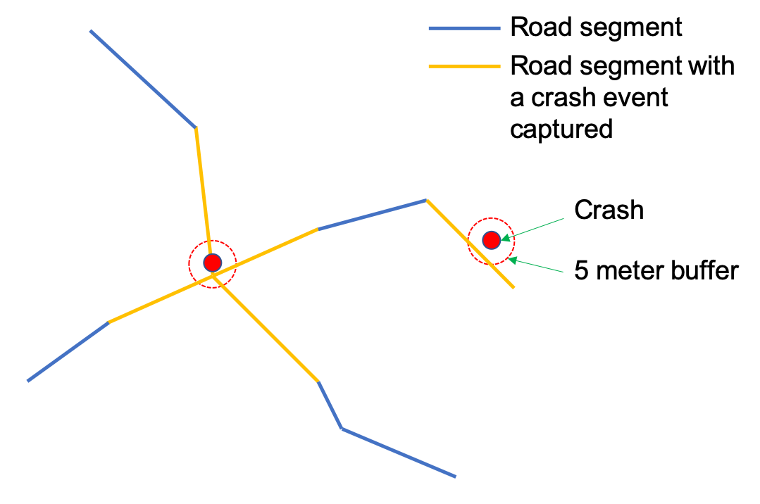
For each road linear segment (Already defined on OSM dataset), we will collect the crashes that happened on a given distance from it, for example, 5m. For that, the GeoPandas function buffer will be used. Note that a single event could be captured in more than one road, on intersections, for example. But we are assuming that this should be important, once all segments are impacted.
Applying Index to Santiago Roads



deg = (meters * 0.1) / 11000and create a buffer for each crash event:
meters = 5
buffer = (meters*0.1)/11000  # degrees
c = crashes[['geometry', 'SEV_Index']].copy()
c['geometry'] = c['geometry'].buffer(buffer)
Next, we need spatial-join roads and buffered crash points
r = roads[['geometry', 'osm_id', 'name', 'fclass']].copy()
f = gpd.sjoin(r, c, how='inner', op='intersects')
We can inspect the resultant geodataframe. Note that lineString is a segment of road that has a single crash event captured. For example, the 2 first lines are the same segment of a street named "Rosas" (osm_id: 7981169) that has 2 crash events captured (index_right: 11741 and 23840).
Now will be important to group the geodataframe, by road segment osm_id. Doing that, we will have the segments aggregating the crashes. We will add the crashes and the severity index. This way, a fatal event for
the example will be 5 times more important than a non-injury one.
Note that this approach is completely arbitrary and not scientific. It is only a personal metric used in this article to compare how danger is a road segment.
f['num_crashes'] = 1
g = f.groupby('osm_id', as_index=False).agg({
  'name': 'first',
  'num_crashes': 'sum',
  'SEV_Index': 'sum',
  'geometry': 'first',
  })
g = gpd.GeoDataFrame(g, crs='4326')
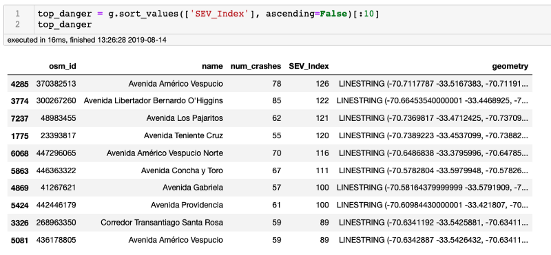
Sorting the geodataframe we will get the above table.
Living in Santiago, this result makes a lot of sense. At least by name, Americo Vespucio and Bernardo O'Higgins are two the most important city arteries.
Let's visualize all streets, having a color associated with each road segment ('Hot Map'):
fig, ax = plt.subplots(figsize = (10,6))
g.plot(ax=ax, column='SEV_Index', cmap='magma_r', k=7, legend=True)
plt.title("2018 Severity Crashes by roads - Santiago City");
ax.set_axis_off();
But, what we should do is to visualize every segment on a real map. For that, we can use Folium. Below a segment of downtown, showing the most danger segment of the so-called "Alameda" (Ave Bernardo O'Higgins).
You can download an interactive map of "The Streets of Santiago" from GitHub.
That's all, Folks!
Conclusion

I hope you could appreciate GeoPandas and Data Science as I do!
For details and final code, please visit my GitHub repository: Streets of Santiago.
For more projects, please visit my blog: MJRoBot.org
Saludos from the south of the world!
See you at my next instructable!
Thank you,
Marcelo