Photopea Creation

Here I have made a poster consisting of what I believe the most famous and influential movies and franchises of our time. I know personally I grew up with these movies as a household name and this poster is dedicated to these.
Supplies:
-Curves tool
-Bevel and Emboss
-Outer Glow
-Text tool
-Rectangle tool
-Images from internet
-Opacity
-Hue and Saturation
Create Background

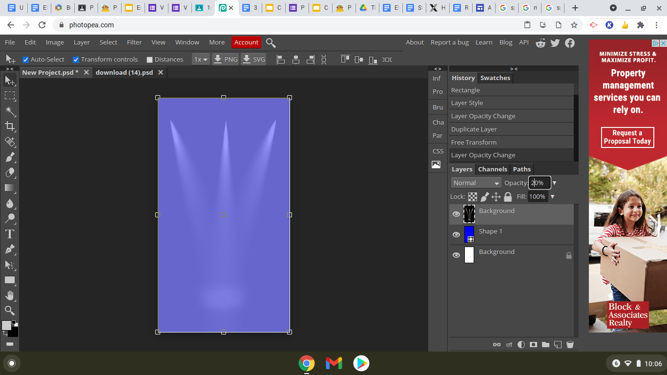
Here I just used a base color of a sorta sky-blue to be my background. I then inserted a picture of spotlights over that color, and lowered the opacity so that they would be very simple and add an easy effect to the background of what would later be movie characters.
Obtain Image of Darth Vader

Because I Darth Vader was one of the 3 characters I was using for the poster, I had to use the lasso tool on him to paste him on the final project and adjust his colors individually. For this step, I made sure to find a good picture of Darth Vader with a solid color as the background. This allowed me to use the magnetic lasso tool and easily crop out a picture of Vader.
Paste Darth Vader Into the Poster

Here, I pasted my cutout of Darth Vader onto my poster. Because I wanted him to be the central focus, I put him in the middle and higher up so that he will be slightly above the other 2 characters.
Inserting Iron Man

Next I picked out a good looking image of iron man, with the same white background so that I could easily lasso it using the magnetic lasso. After this, I then inserted it into the poster.
Inserting Harry Potter

I then added in Harry Potter, cutting him out using the magnetic lasso tool and I pasted him onto the poster.
Placing and Editing the Characters


I continued on to positioning the characters in a way that they were easily visible and were not hidden from plain sight. I then added an outer glow to Iron Man and Harry Potter so that they would fade more easily into Darth Vader and the background.
Adjusting the Colors and Vibrance


I then began to adjust the colors and brightness of these characters. I did this so they blend in more easily and do not look so unnatural against the background and each other. I made a new layer and used things like the curve tool, brightness, and hue and saturation.
Inserting Adjusting the Phrase

I then insert the phrase for the poster and use the bevel and emboss tool to improve its look and overall compatibility with the background.